Topaz NG
About
A vector interpretation of the venerable “Topaz” font, used on Amiga’s workbench.
Why?
These days I find many of the modern mono-spaced fonts, while functional, tend towards looking generic and similar to each other - lacking character. On the other hand, many font’s with character tend to fall into the novelty category, styled to look artistic but are impractical as a general purpose system-font.
For some reason I always liked the Amiga Workbench aesthetic, it’s crisp, awkward/colorful/brutalist design from the 90’s appeals to me.
This font aims to balance the retro aesthetic with the requirements of mono-spaced fonts on modern systems. Minimal changes have been made so the font can be used as a terminal font and for software development.
Approach
The font was made by tracing “Topaz 11”, then scaling the aspect as to match an NTSC output. As the result is quite heavy, this is used for the “Bold” weight, with the outlines slightly contracted for the “Regular” weight.
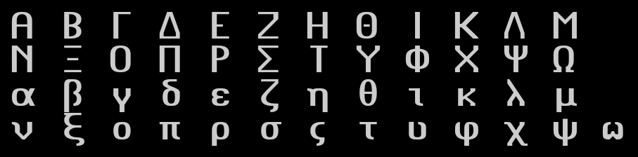
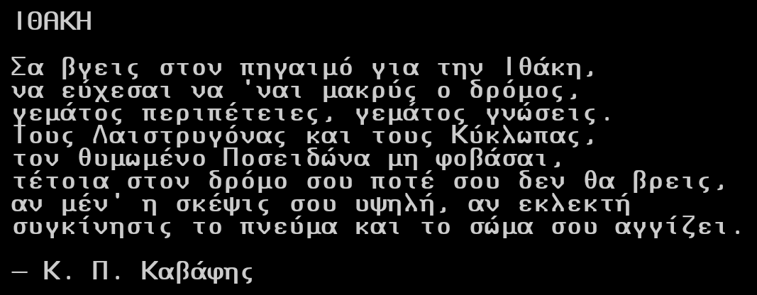
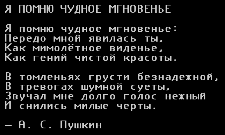
Glyphs for characters not found in the original (Greek & Cyrillic) have been created, following the Latin style.
Examples
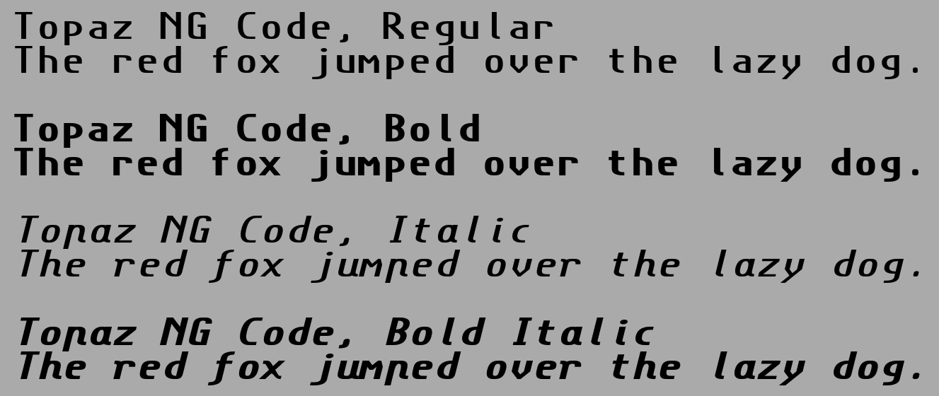
- Styles
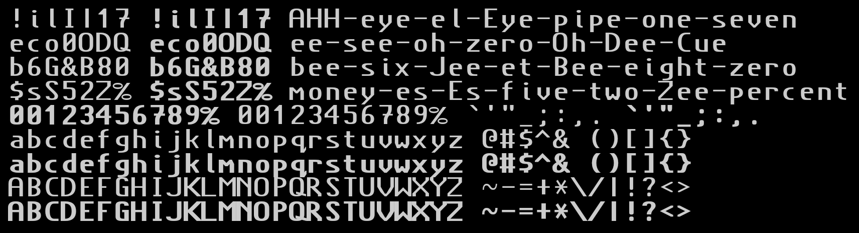
- Alphabet
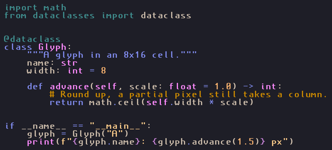
- Code (Python)
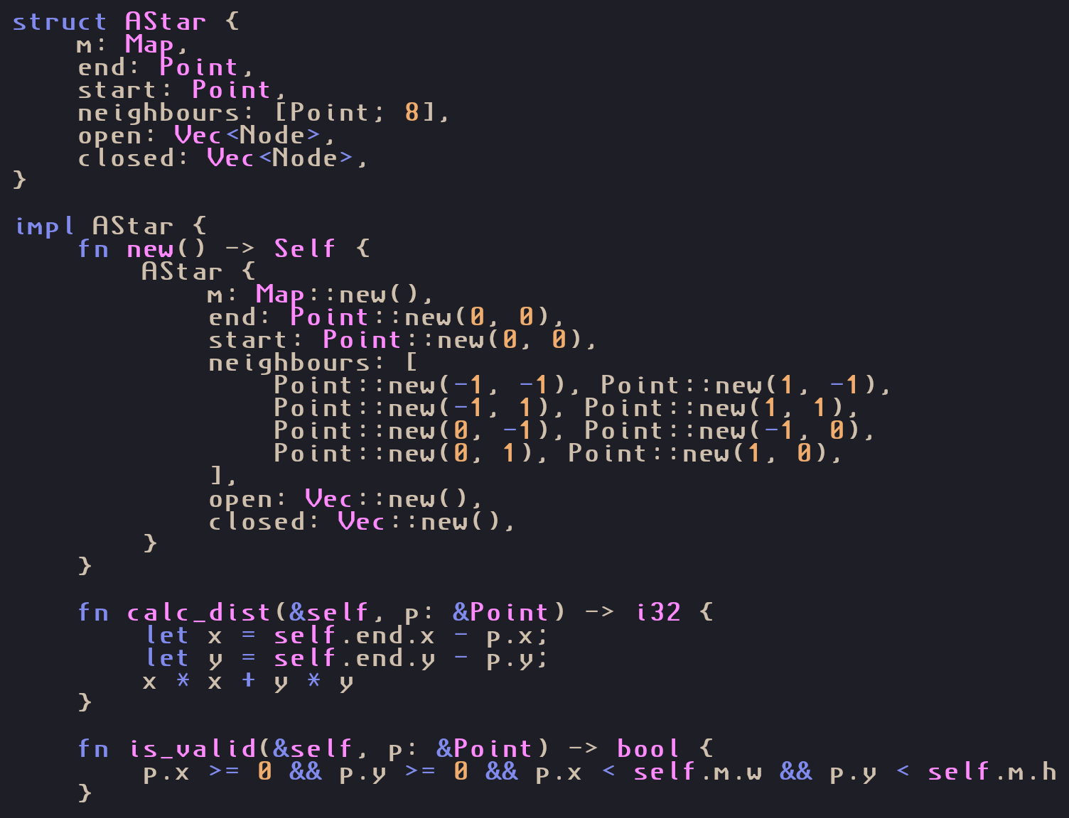
- Code (Rust)
- Box Drawing
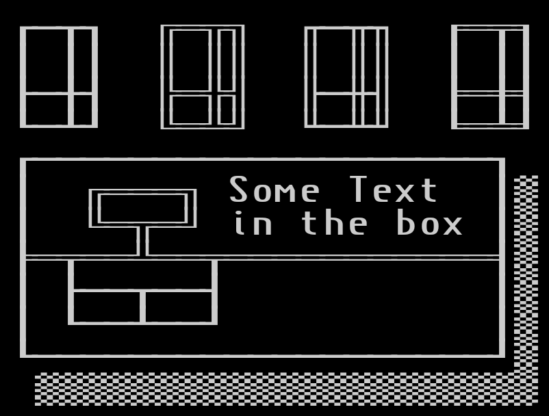
- Box Drawing Alignment Test

- Greek Alphabet
- Greek Prose
- Cyrillic Alphabet

- Cyrillic Prose
License
Released under the SIL Open Font License 1.1, see LICENSE.